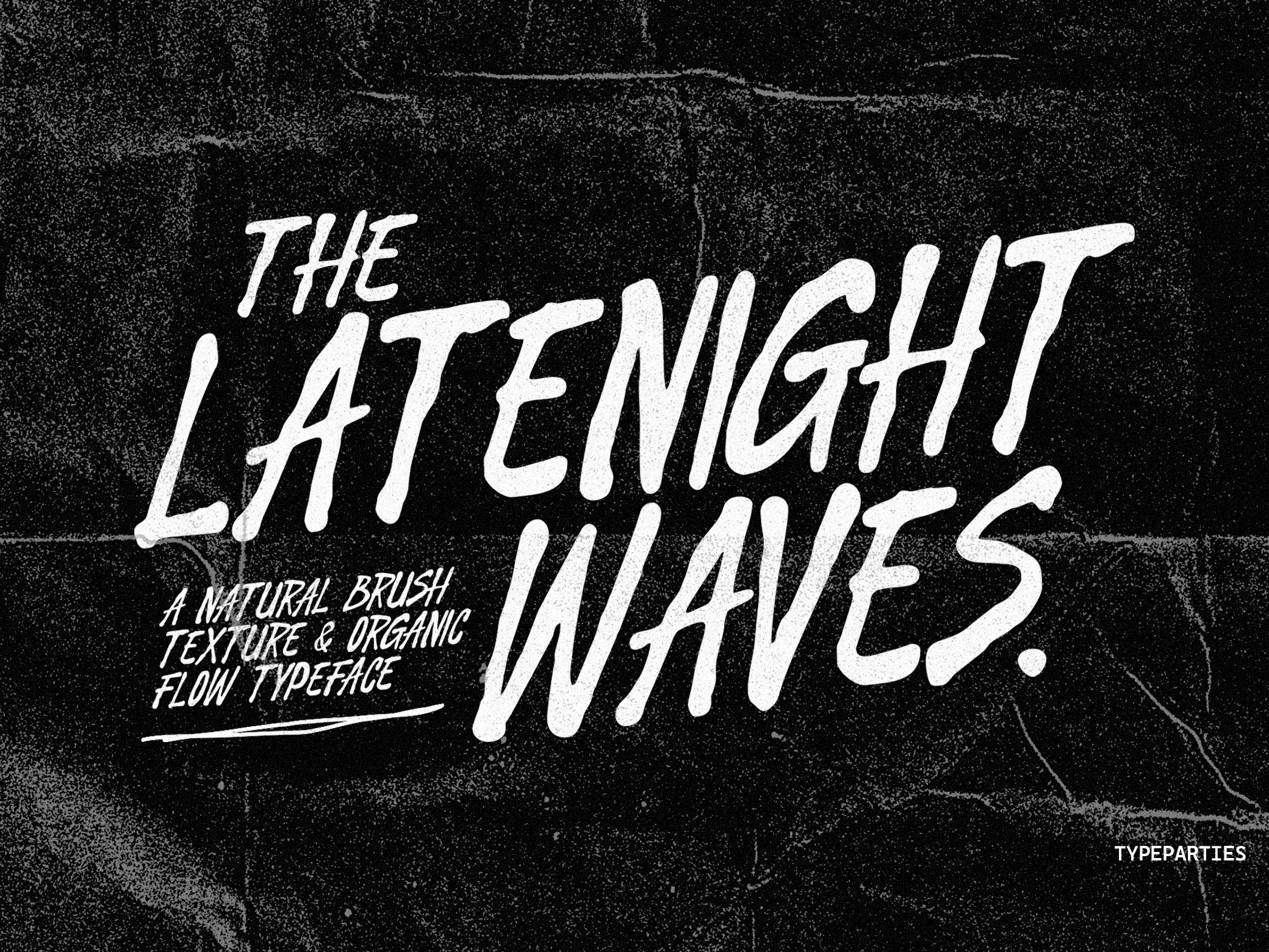
Actually created Rainshade Condensed from the idea that imperfect shapes always feel more alive than clean geometry. I wanted a condensed font that felt stretched, restless, and emotional — like old gig posters left under rain, photocopied zines, or underground club flyers taped across city walls at 2AM.
Instead of building perfectly straight lines, I let the characters move organically. The subtle waviness and uneven texture give the typeface a human pulse, making every word feel raw and cinematic. It has that balance between controlled structure and visual chaos — narrow enough to feel compact, but expressive enough to dominate a layout instantly.
Rainshade Condensed was designed for creators who love bold typography with personality. It works especially well for music artwork, fashion branding, experimental editorials, indie films, dark packaging, and modern poster culture. The tall proportions create strong vertical movement, while the handmade imperfections keep the font feeling emotional rather than mechanical.
Format Included
(.otf, .ttf, .woff, .woff2)
Features
Uppercase - Lowercase - Numerics - Punctuation - Multilingual