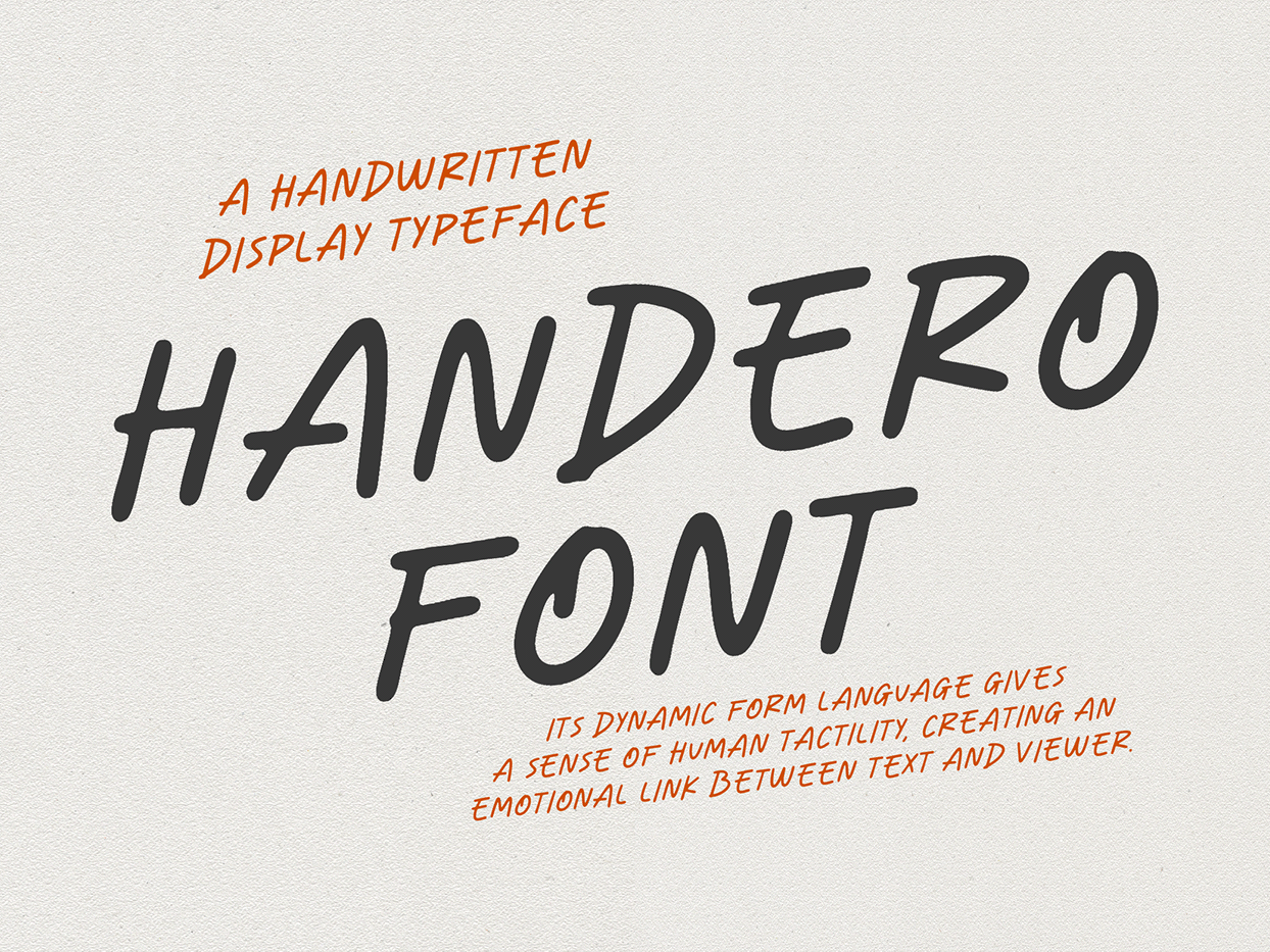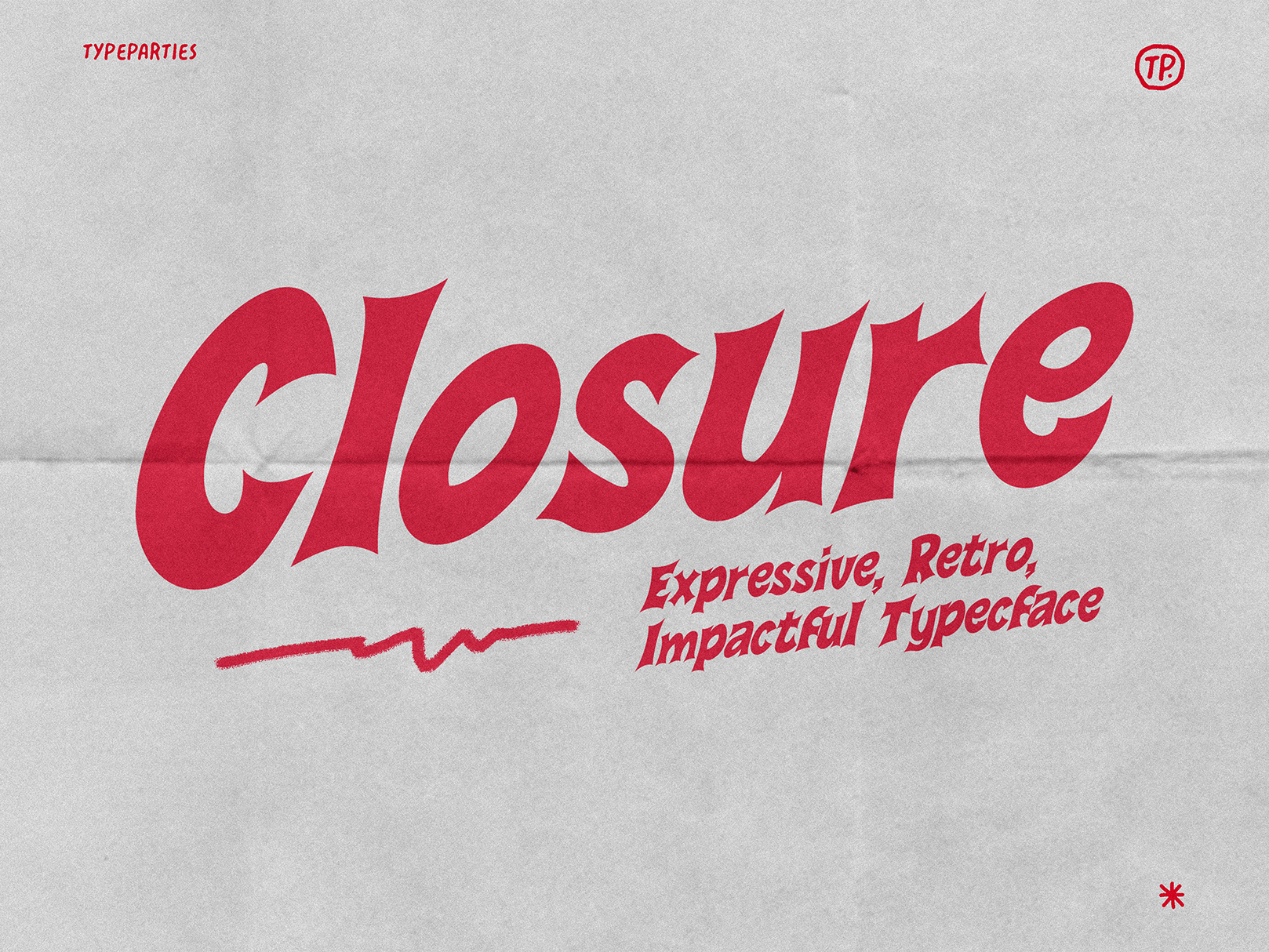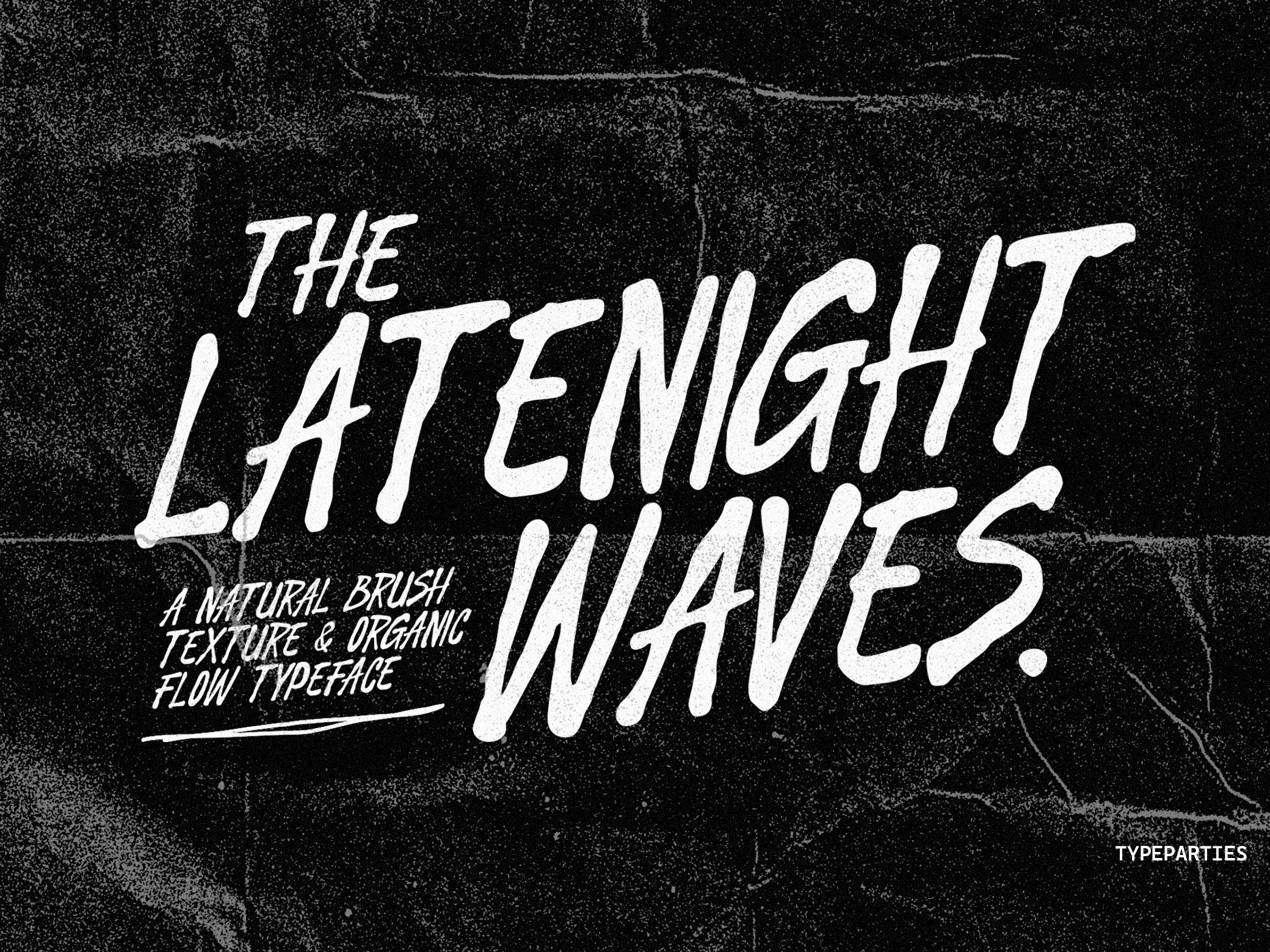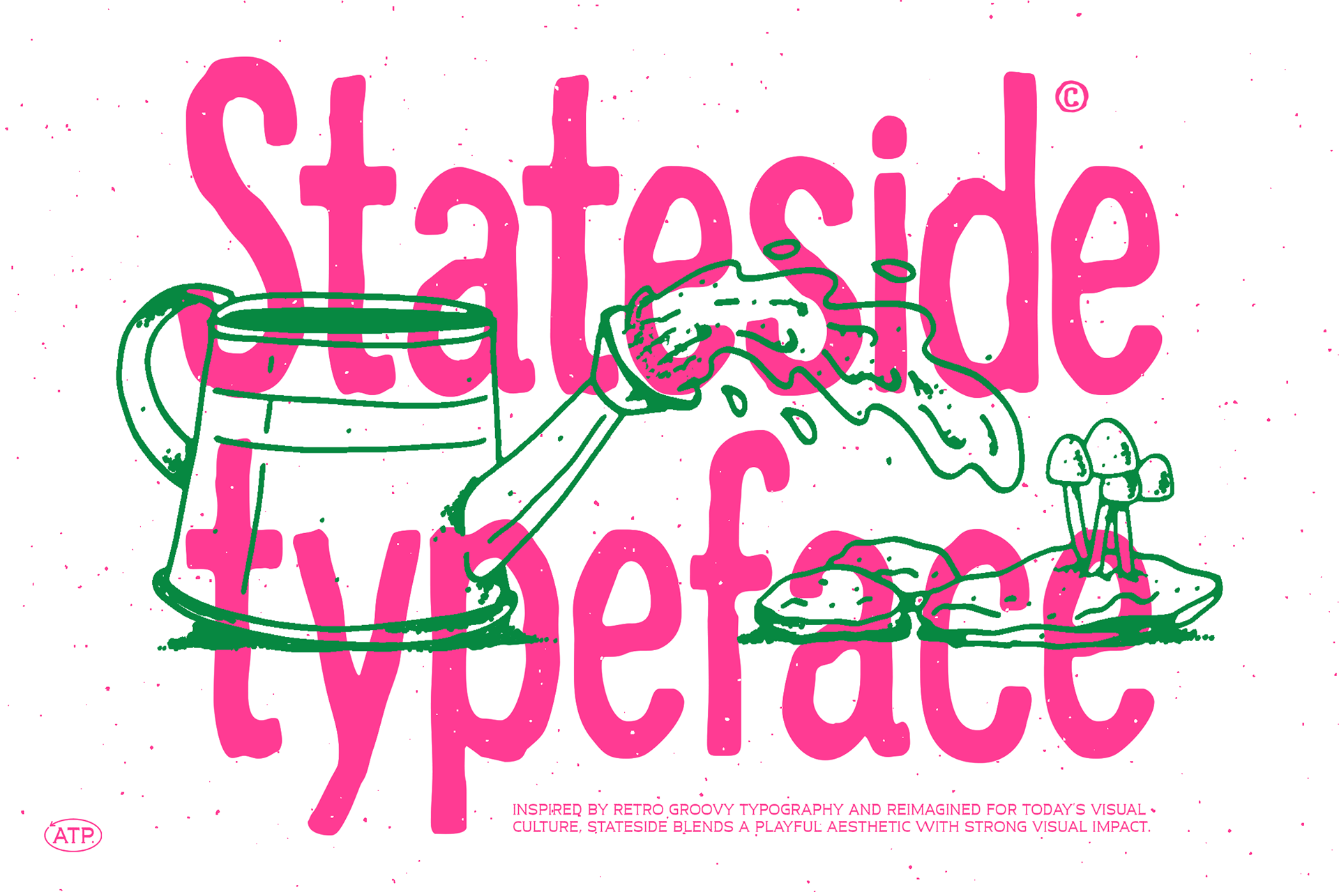

ATP Stateside - Playful Display Font with Retro Groovy Energy
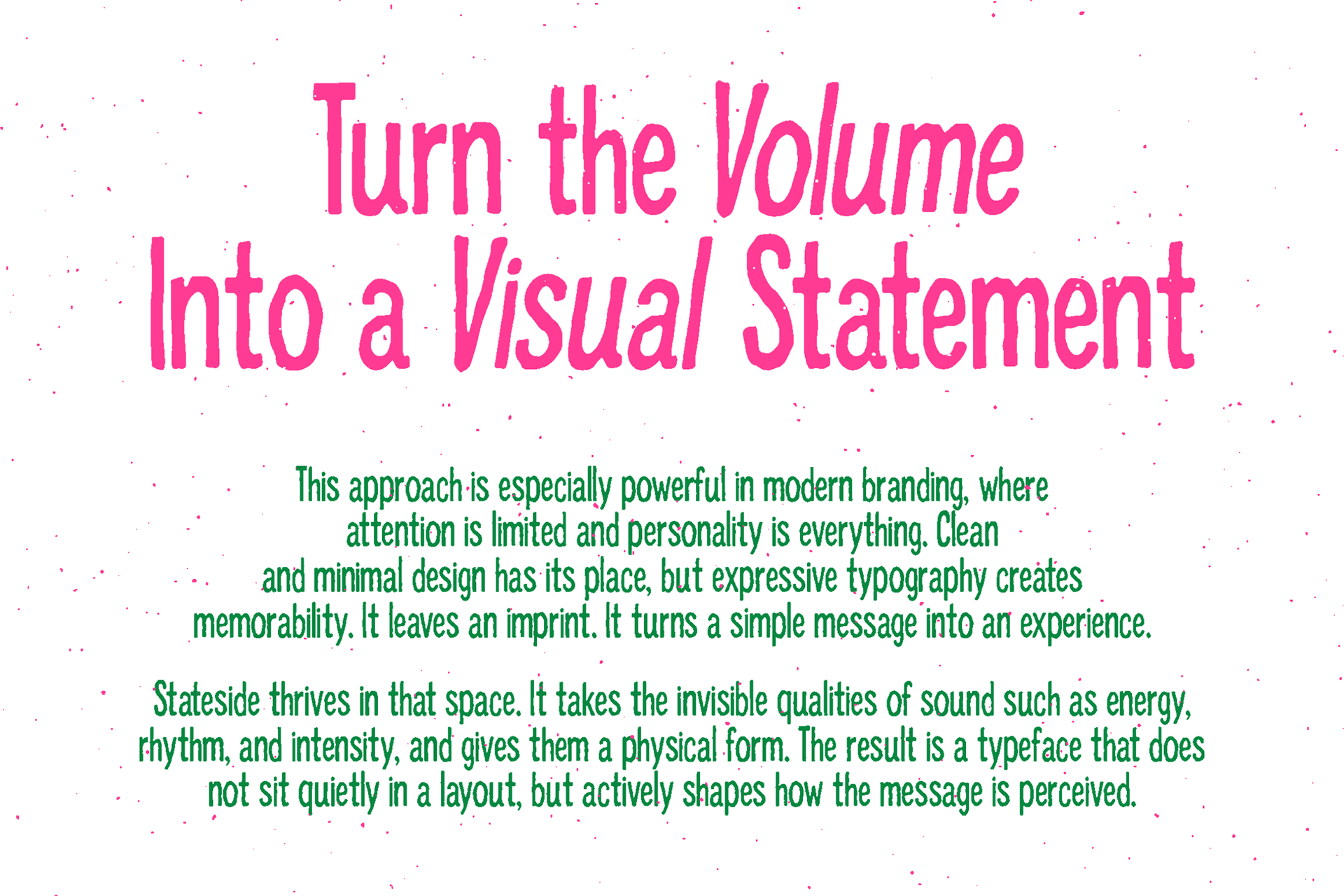
We didn’t design this typeface to behave. We designed it to feel.
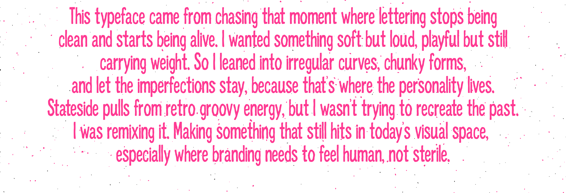
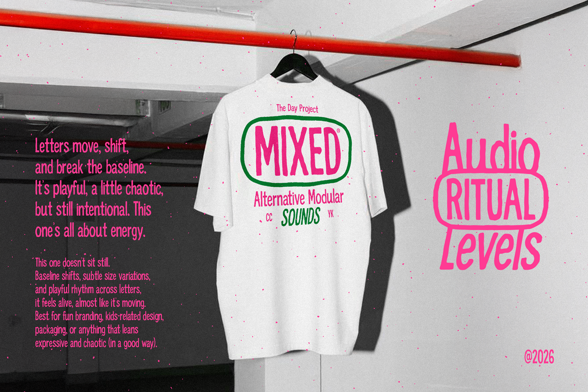
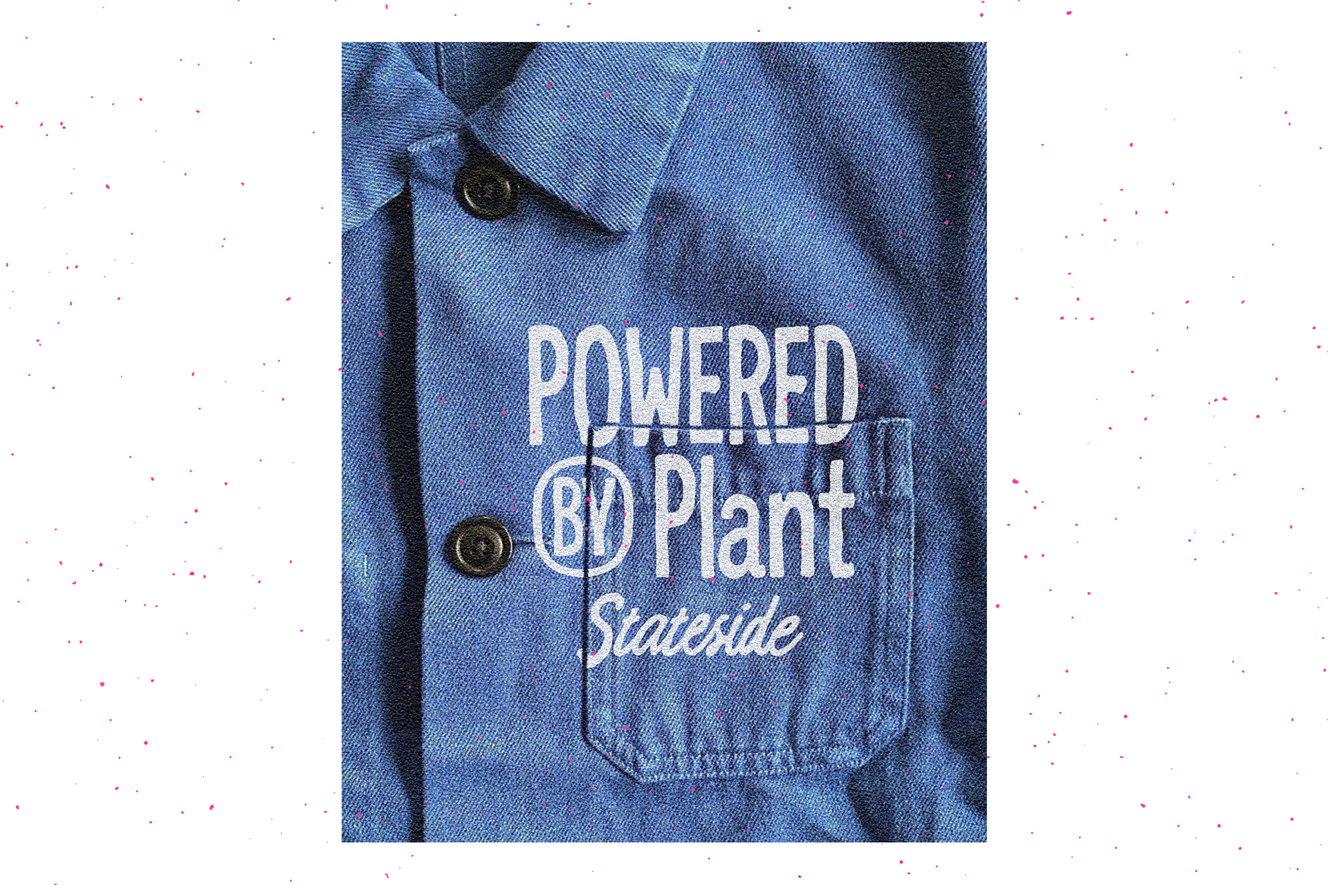
This is a hand-driven, high-impact display typeface that lives somewhere between naive lettering and controlled chaos. Every curve carries a human pulse. Every stroke refuses to be perfectly geometric. It leans into imperfection on purpose, giving it that raw, almost stubborn personality that polished fonts usually try to hide.
The forms are soft, rounded, and slightly swollen, but not in a cute or predictable way. There’s tension in the shapes. The terminals feel blunt yet alive. The vertical rhythm isn’t rigid, and that’s exactly where the charm hits. It creates a visual cadence that feels spoken rather than typeset.
The proportions are slightly condensed but elastic. Some characters stretch, others compress, creating a natural inconsistency that makes words feel like they’re moving. It’s expressive without trying too hard. Loud, but not screaming. Confident in a way that doesn’t ask for approval.
This isn’t about readability in long paragraphs. This is about presence. About grabbing space and owning it.
We made this for designers who are tired of neutrality.
For work that needs a voice, not just a font.
For work that needs a voice, not just a font.
Format Included
( .otf -.ttf - .woff - .woff2)
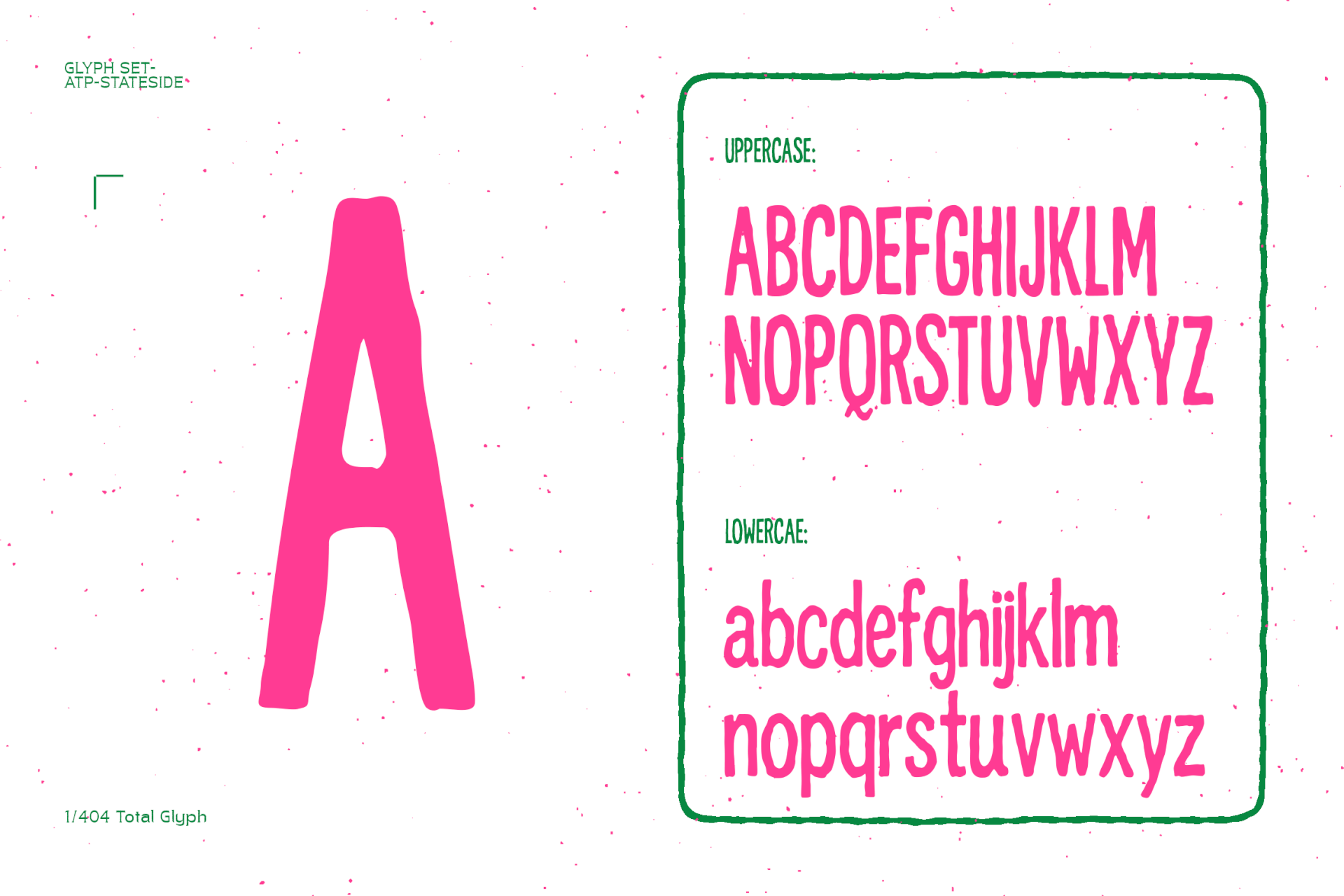
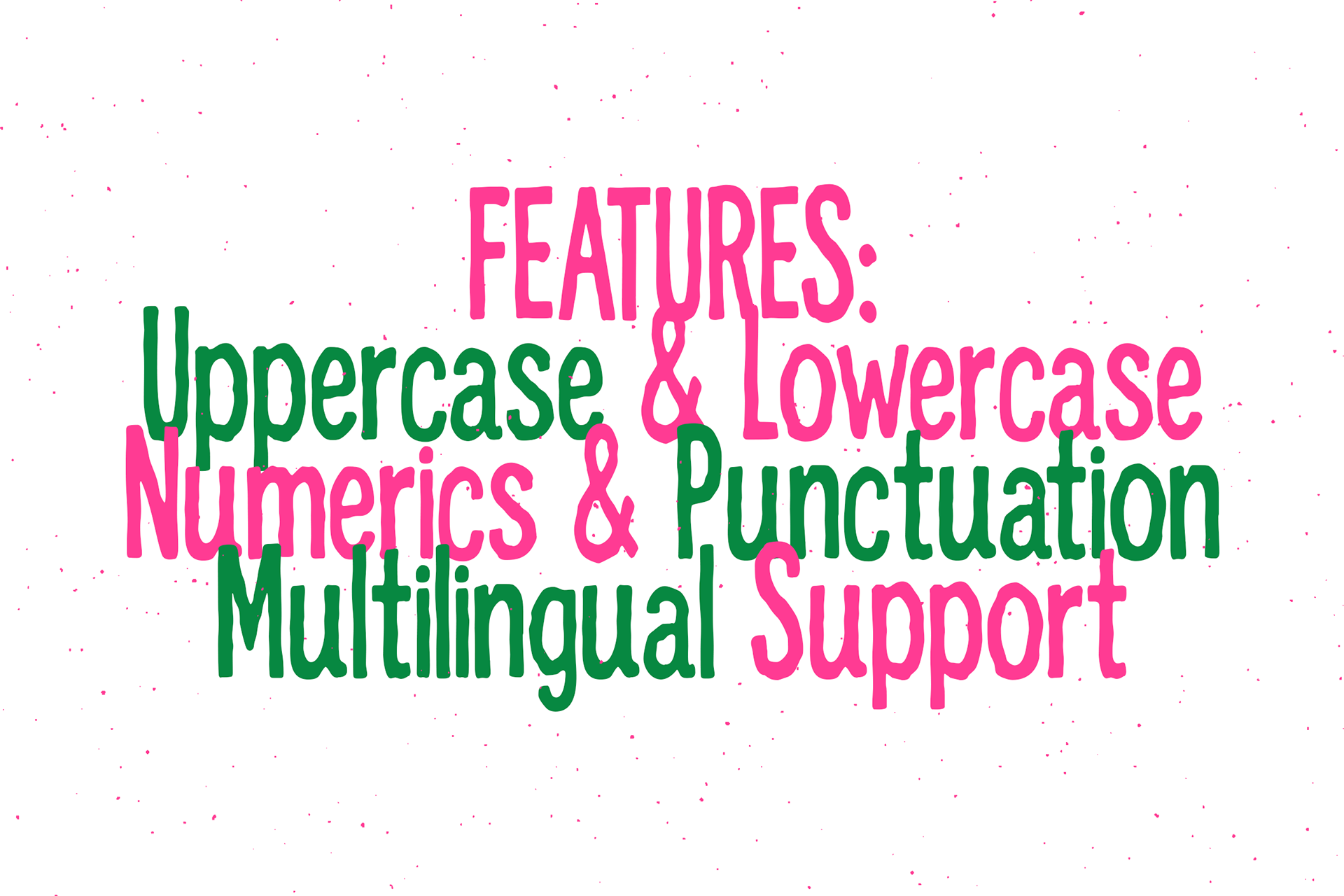
Features
Uppercase - Lowercase - Numerics - Punctuation - Multilingual
DOWNLOAD HERE