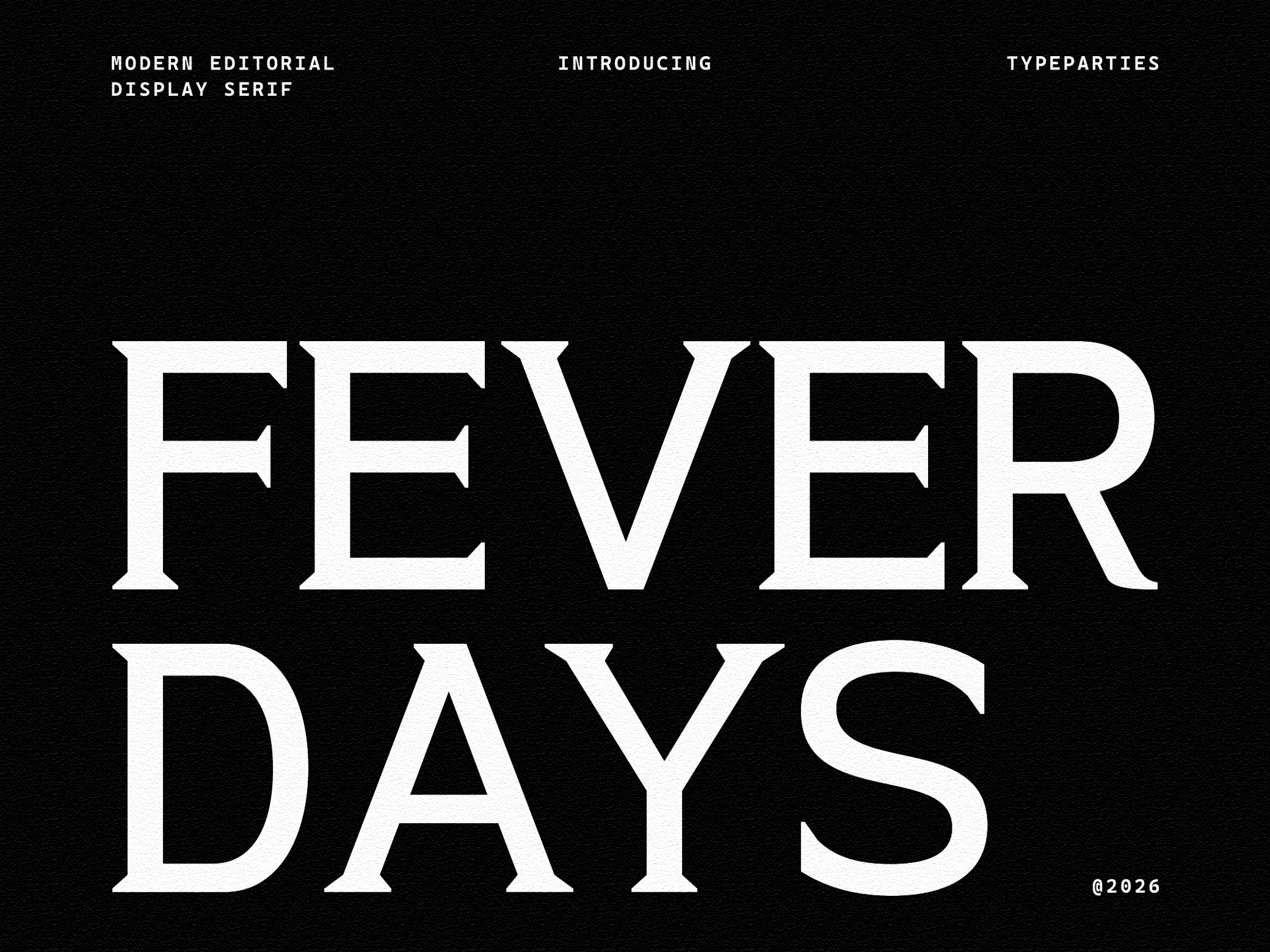
Casualte Alt - Bold Condensed Font
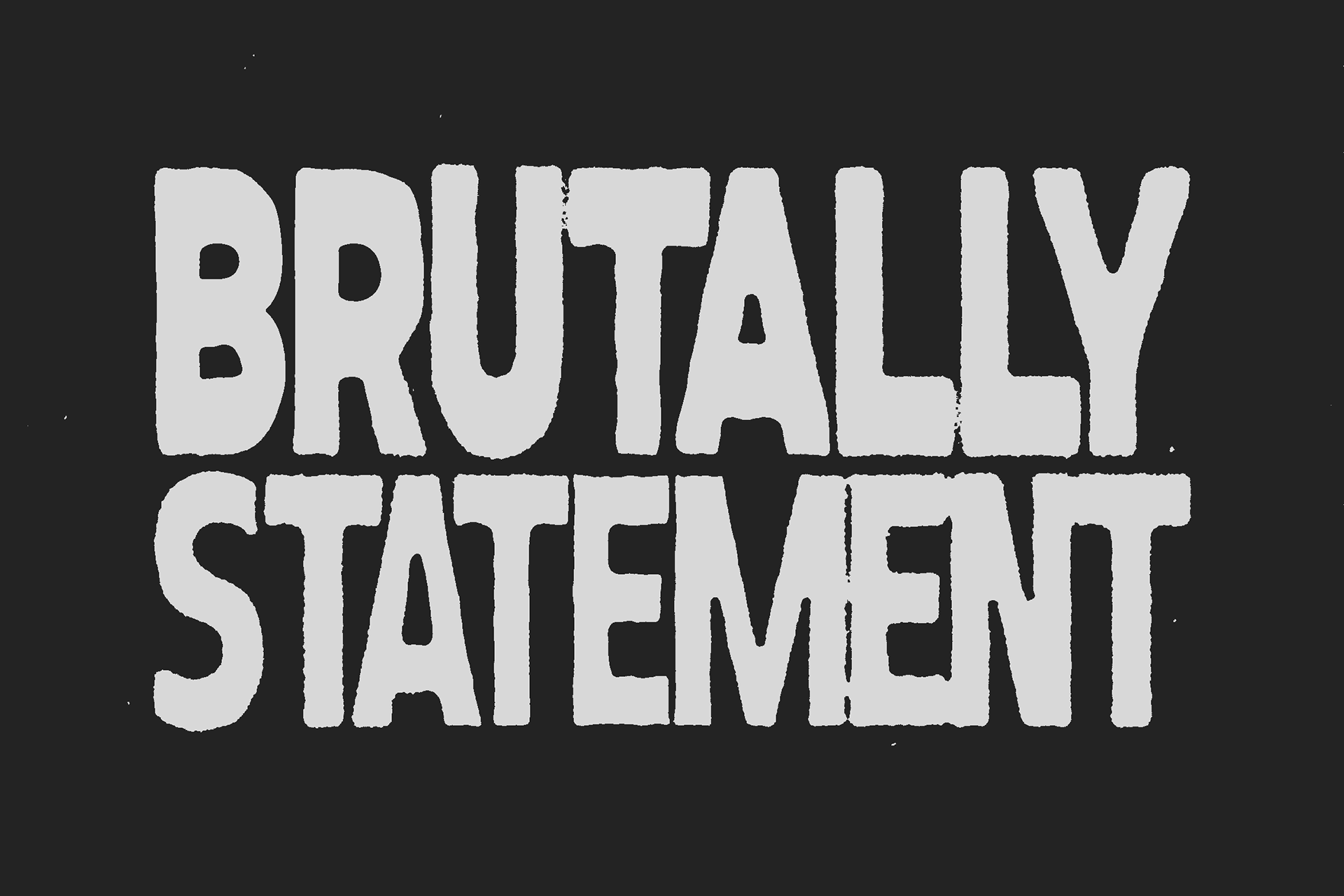
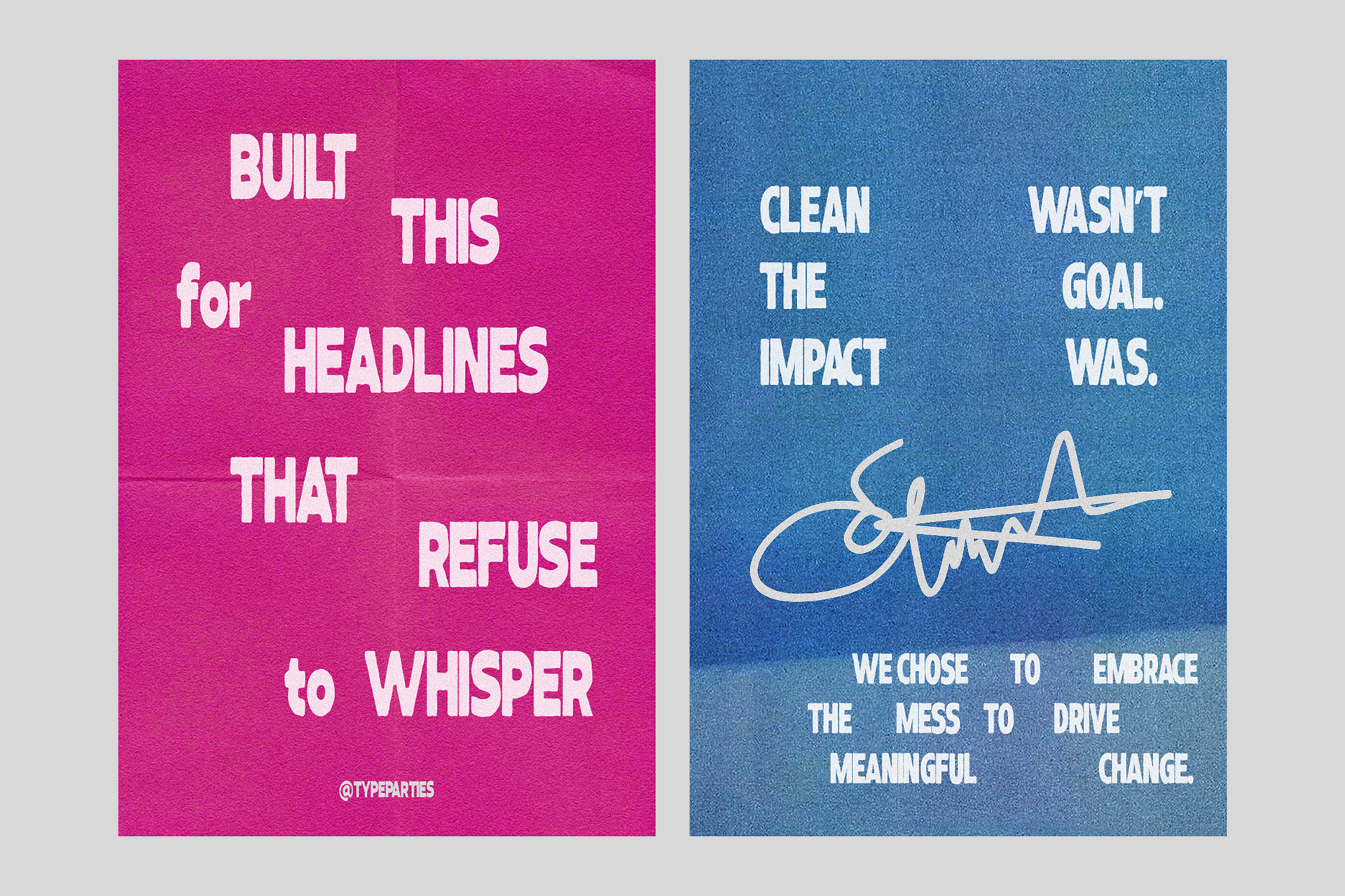
This typeface doesn’t ask for attention. It takes it.
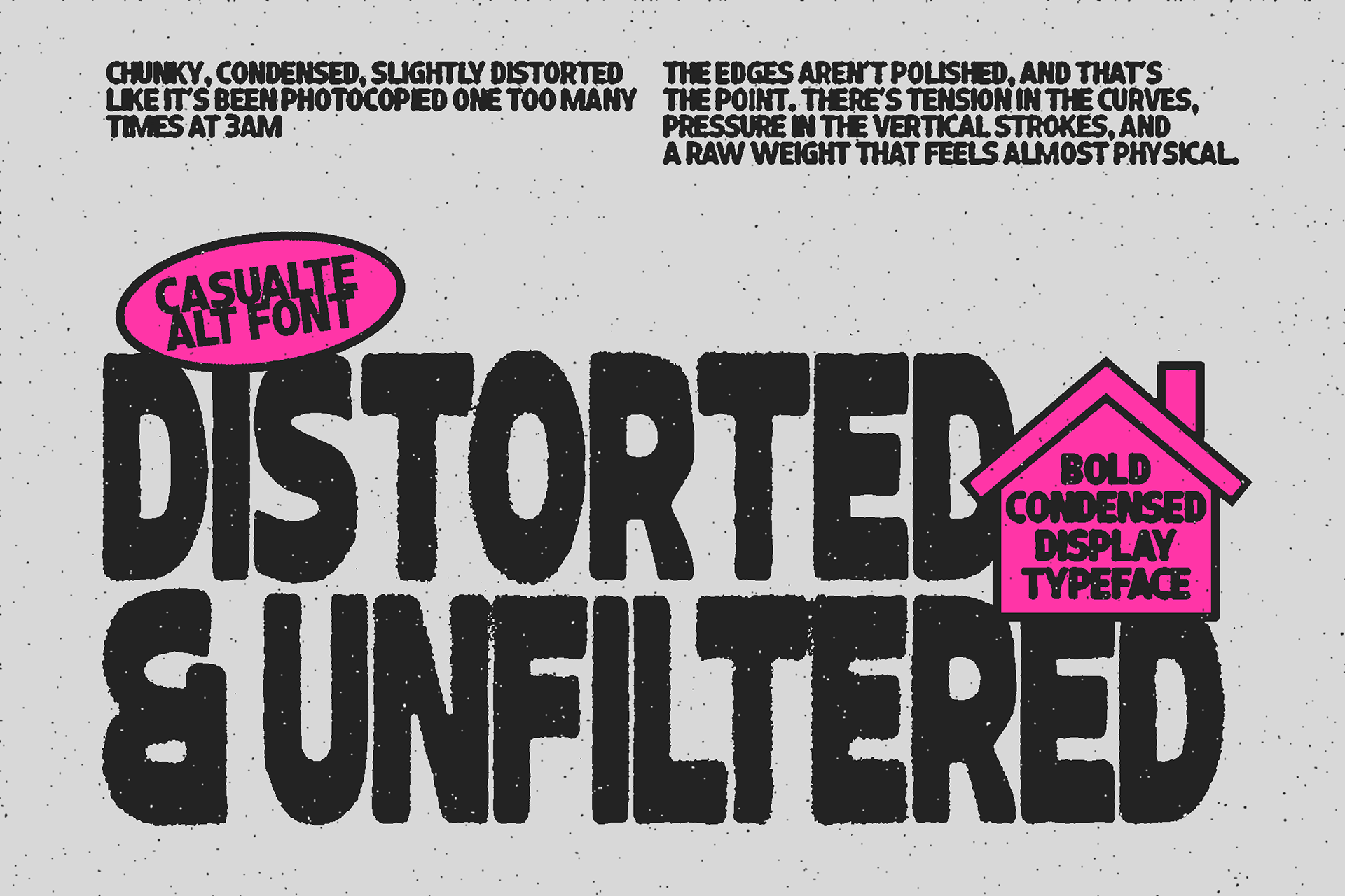
Chunky. Condensed. Slightly distorted like it’s been photocopied one too many times at 3AM. The edges aren’t polished, and that’s the point. There’s tension in the curves, pressure in the vertical strokes, and a raw weight that feels almost physical.
It reads like a headline that’s done being polite.
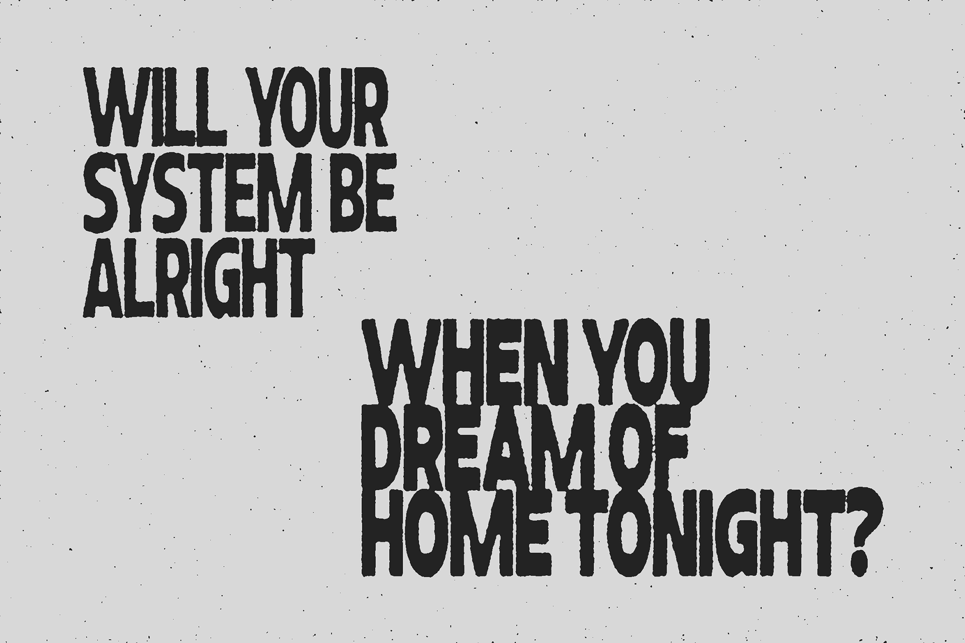
Technically, it sits in the realm of a bold condensed display sans serif, but emotionally? It’s protest ink. It’s basement gig posters. It’s underground editorials printed on cheap paper with expensive opinions.
The tight counters and compact structure create density, making every word feel packed and intentional. The subtle irregularity in the outlines adds grit, preventing it from feeling digital-perfect. It has that hand-shaped distortion that makes layouts feel alive, not templated.
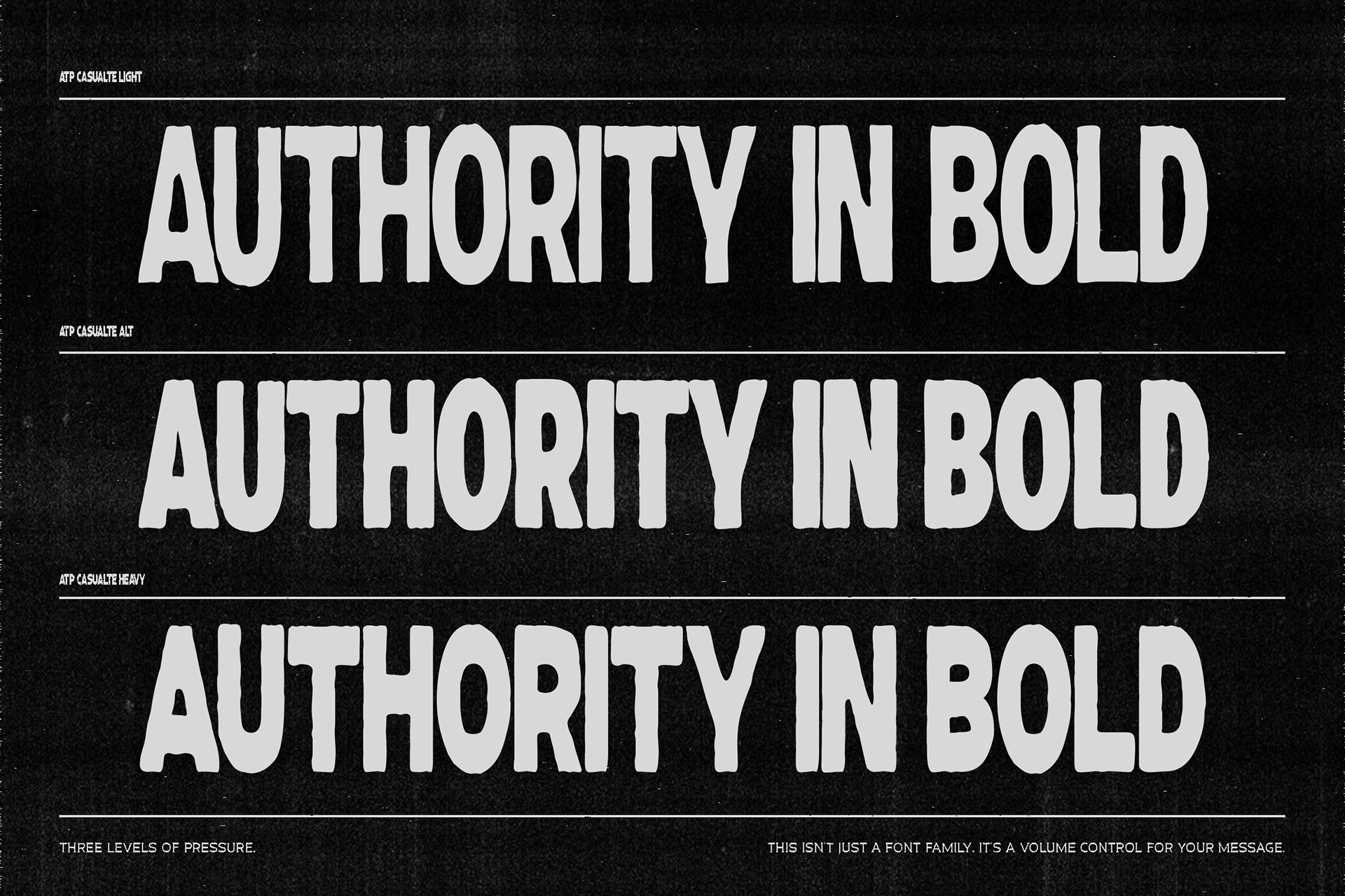
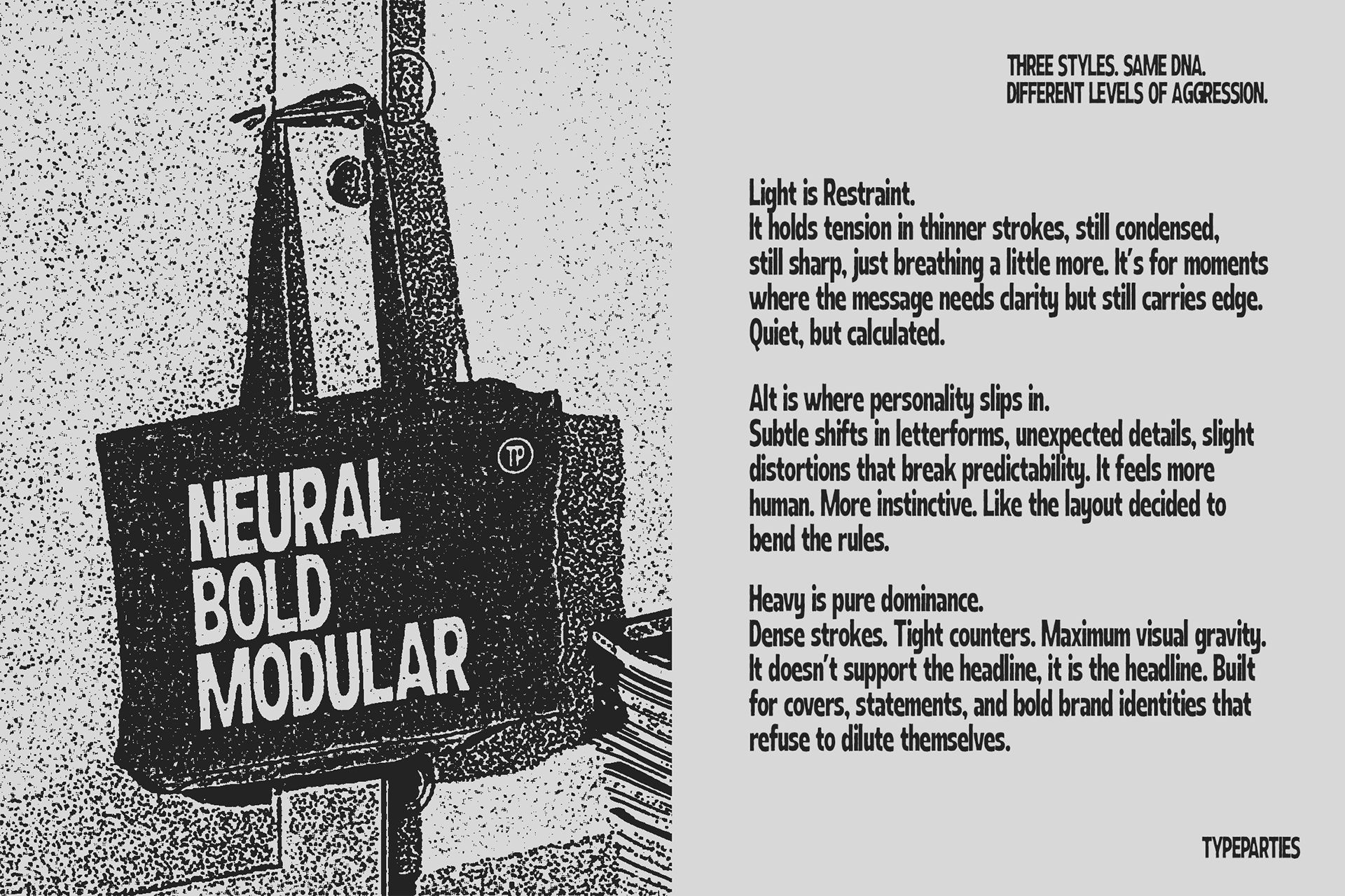
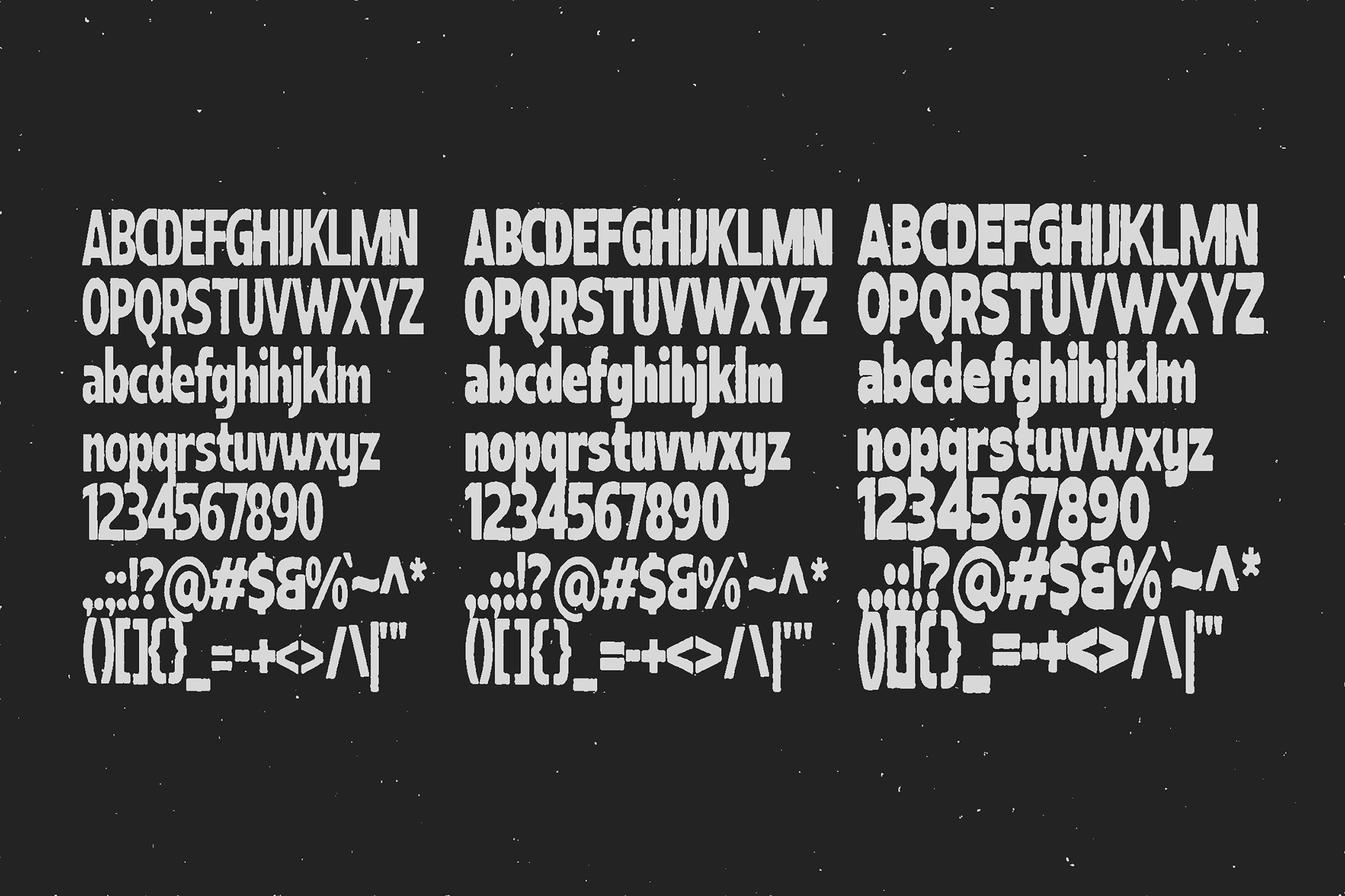
This typeface comes in three distinct styles,
each one carrying a different level of intensity.
Format Included
( .otf, .ttf, .woff, .woff2)
Features
Uppercase - Lowercase - Numerics - Punctuation - Multilingual
DOWNLOAD HERE
-