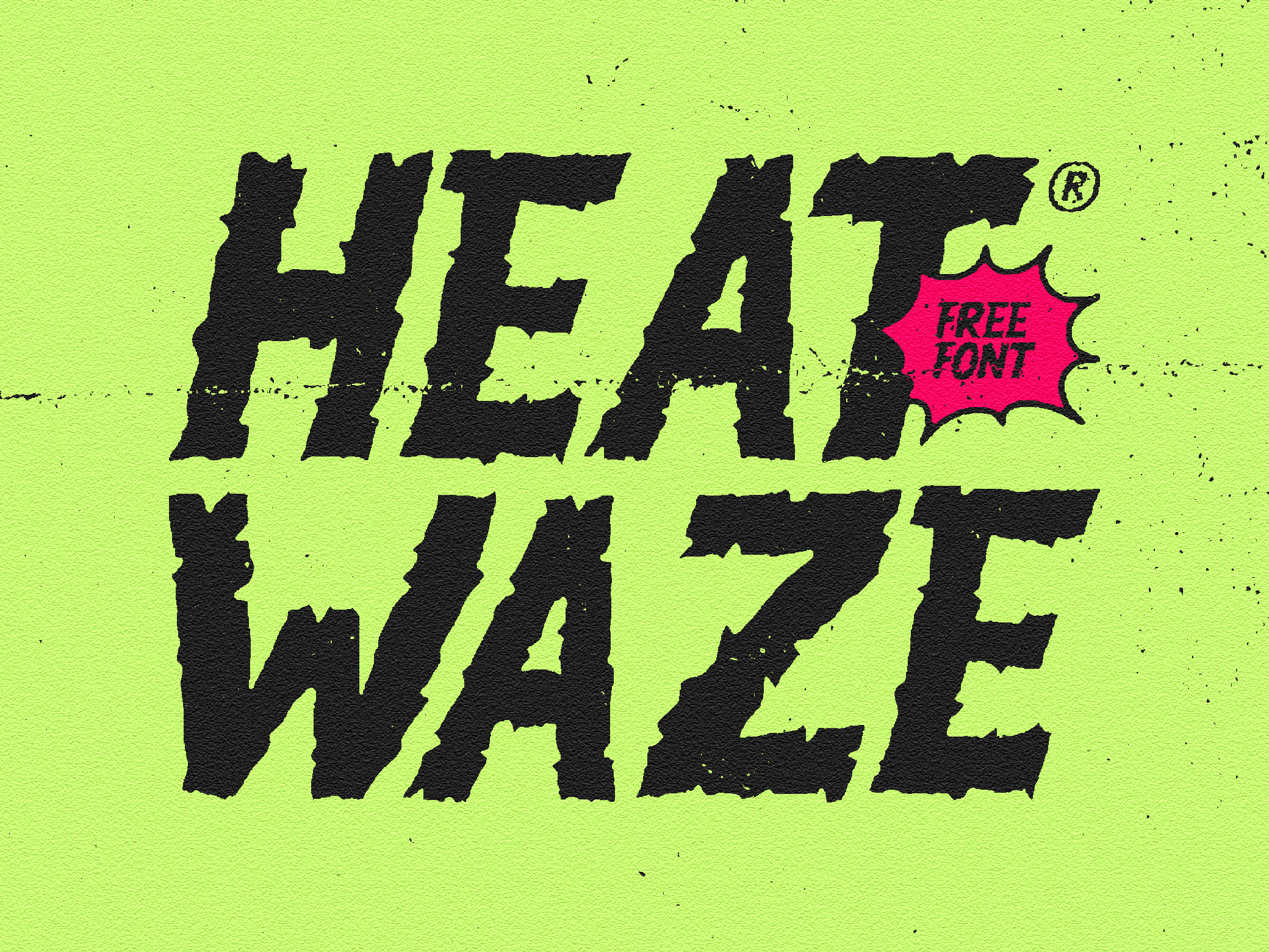
Farde - Condensed Display Serif
Farde was built from the idea that familiarity doesn’t have to feel safe, it can feel loud, strange, and alive.
I wanted to make a typeface that feels like the streets I grew up looking at: old shop signs, fading posters on walls, hand-painted lettering fighting against time. There’s something raw in imperfect letters, something honest. So instead of chasing clean geometry, I leaned into tension, stretched proportions, sharp serifs, and uneven flow to make it feel human.
As a creator, I kept thinking about how a Farde is never just a place, it’s personality. It’s noise, stories, corners, movement. That became the DNA of this font. Tall forms to create presence, soft distortion to keep it organic, and bold character shapes that feel almost spoken rather than written.
It feels vintage, but not stuck in the past.
Rough, but intentional.
Familiar, but with its own strange voice.
Rough, but intentional.
Familiar, but with its own strange voice.
A typeface made like a place: full of character, history, and friction.
Format Included
(.otf, .ttf, .woff, .woff2)
Features
Uppercase - Lowercase - Numerics - Punctuation - Multilingua
DOWNLOAD HERE