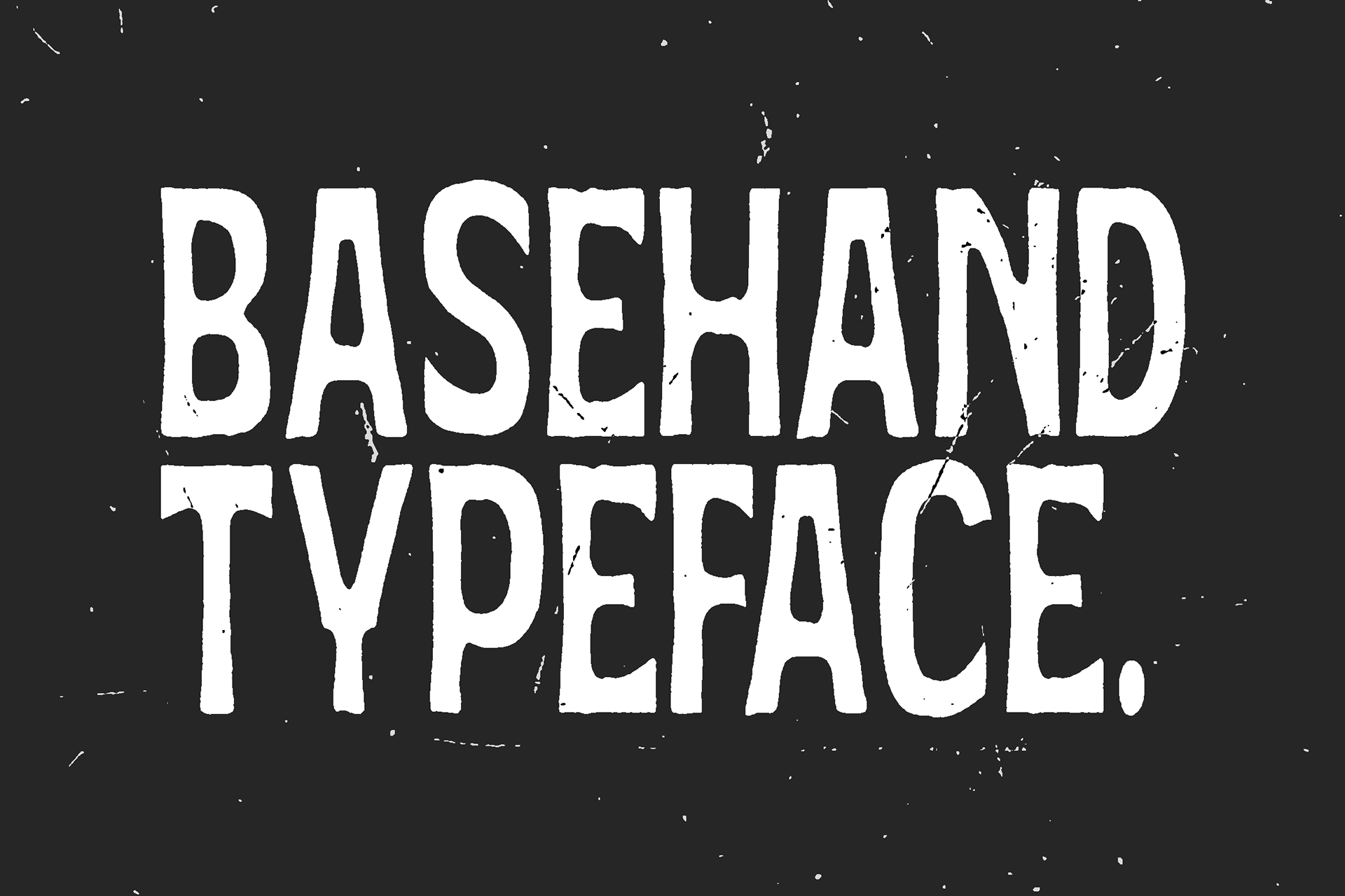

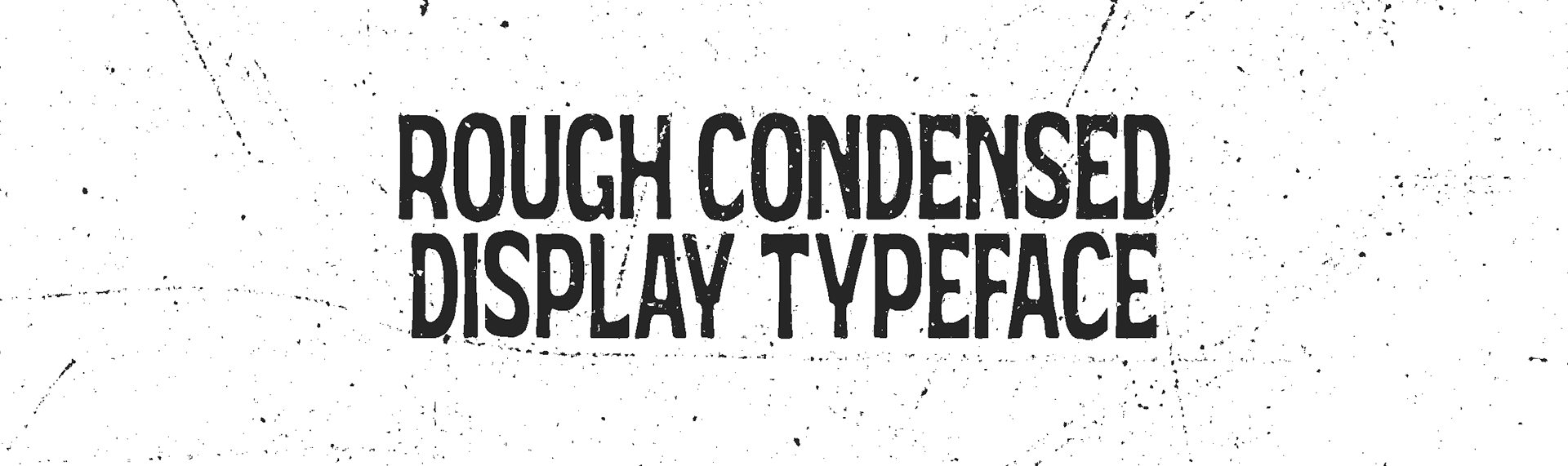
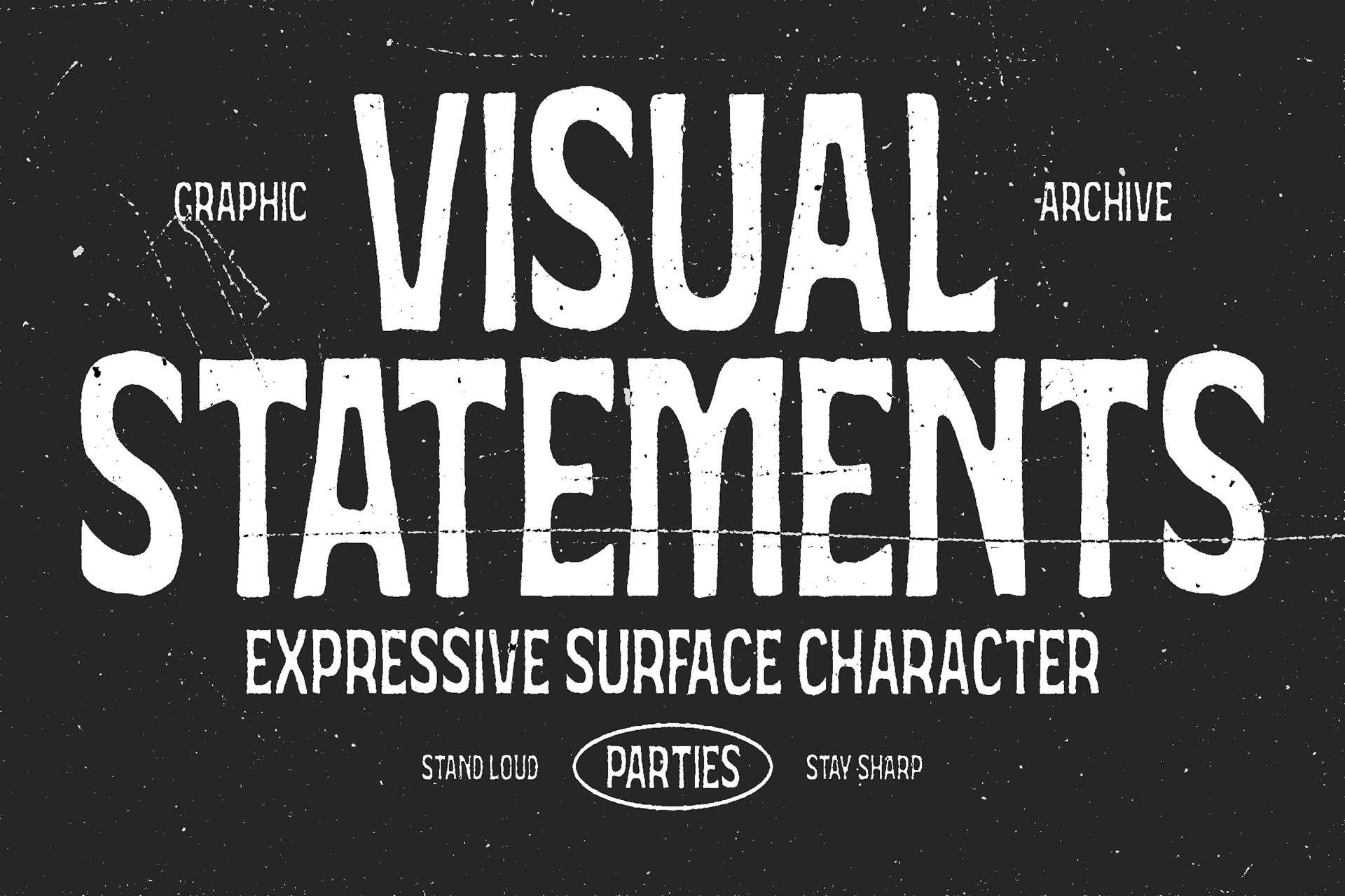
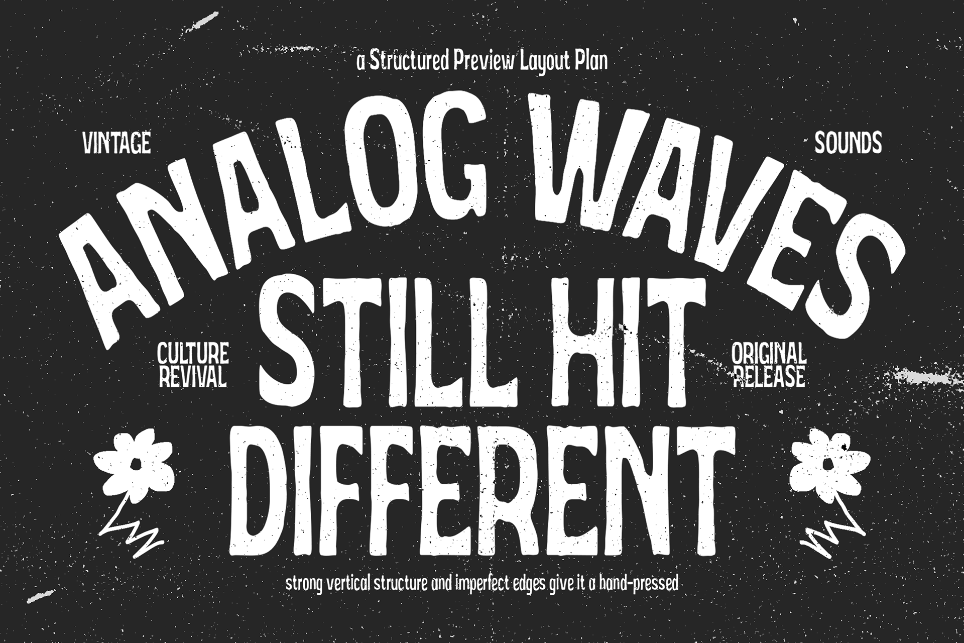

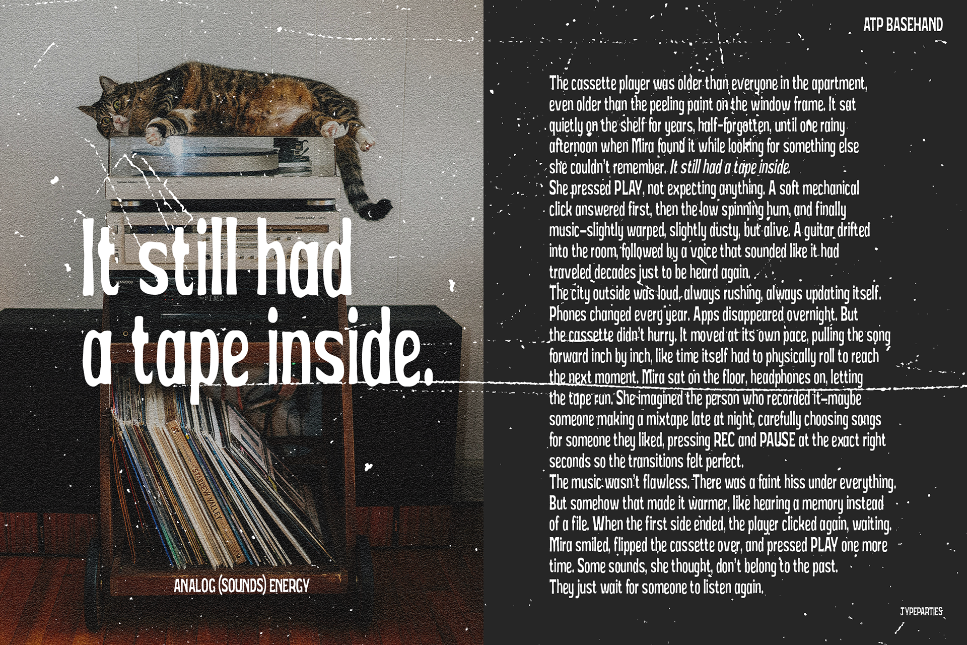


Basehand - Rough Condensed Display Font
I designed Basehand as a response to something I often felt missing in many modern display fonts: raw energy that still feels intentional. The goal was not to create something perfectly clean, but to build a typeface that carries the emotional texture of real print processes, including ink pressure, rough edges, and the slight unpredictability seen in stencil or screen-printed lettering.
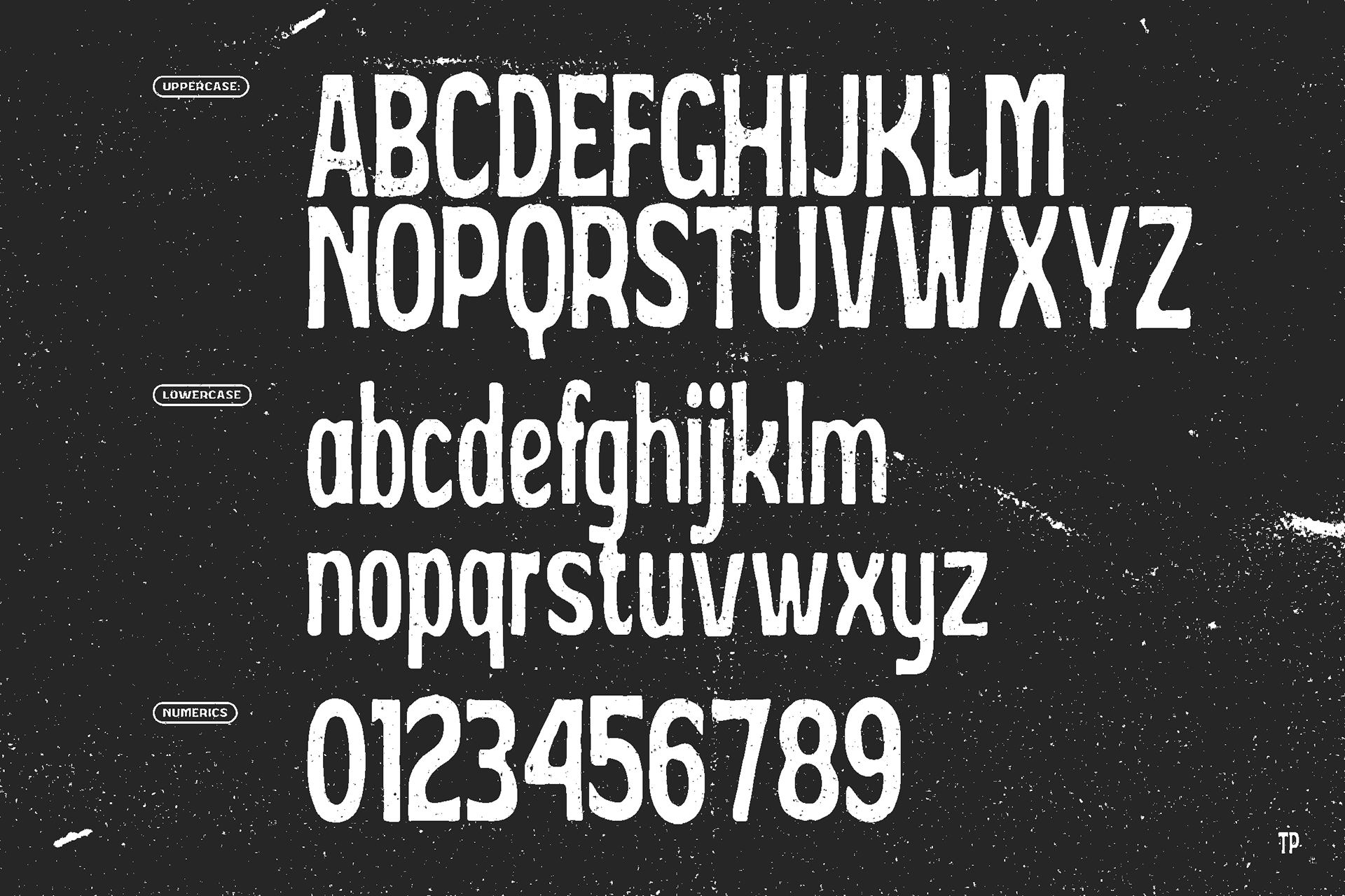
Every character was constructed on a condensed structure so designers can push stronger headlines into tighter spaces while maintaining visual impact. The rough contours are carefully controlled, not random, allowing the typeface to remain readable while still delivering a handcrafted intensity. I wanted it to feel loud, human, and slightly rebellious, yet dependable enough for branding, posters, packaging, and editorial applications.
Basehand represents my exploration of how imperfection can be engineered with precision, where expressive texture and modern typographic discipline meet to create a display typeface that immediately commands attention.
Format Included
( .otf -.ttf - .woff - .woff2)
Features
Uppercase - Lowercase - Numerics - Punctuation - Multilingual
DOWNLOAD HERE